Color Concepts & Choropleth Mapping
GIS 6005 Communicating GIS
Lab 4
Part 1: Working with RGB and HSV Colors
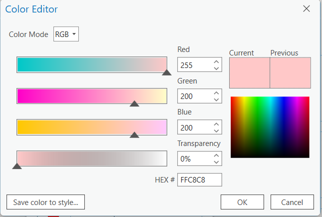
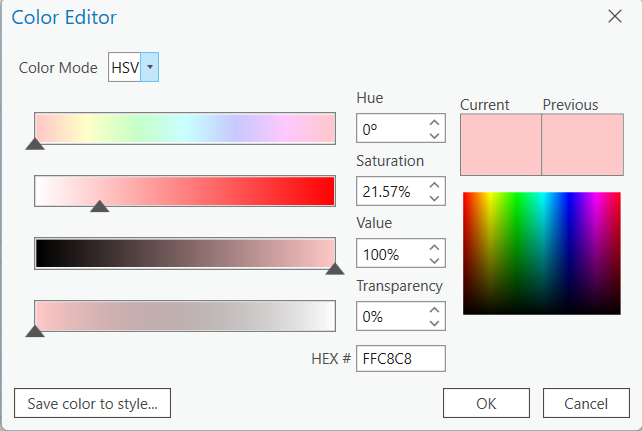
“Color is three dimensional” (Brewer, 2016, 130). There are several systems for specifying colors within a computer system (Brewer, 2016, 129). This section of the lab has us compare the values for identical colors between RGB and HSV systems. RGB stands for Red, Green, and Blue and HSV stands for Hue, Saturation, and Value.
Observe the screenshots below looking at the color properties of one color in RGB and HSV:
Part 2: Creating Meaningful Color Ramps
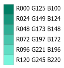
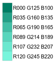
“If all you had to do was choose pretty colors, the task would be fairly straightforward…” (Brewer, 2016, 129). Choosing colors that are appropriate and representative while preserving the 5 principles of map design can be a daunting task. In this lab we are specifically looking at selecting color ramps for choropleth maps. The color ramps above illustrate how important it is to consider your choices carefully. The first image is of a linear progression where the intervals are equal. The next image is an adjustment of the first where the values of the darker colors have a larger interval and the values of lighter colors have a smaller interval. Because I chose my lightest color too close to the darkest color (should have been much lighter), the difference between the two is slight. In the adjusted progression, the lighter colors are much closer together than the darker colors. The color brewer color scheme has a much larger difference between the light and dark colors than the one that I chose. This makes the color steps much more pronounced and effective.
Linear Progression:
Adjusted Progression:
Comparison between linear and adjusted:
ColorBrewer:
Part 3: Color Ramps in ArcGIS Vs. Color Brewer
Understanding hue, saturation, lightness, and how to mix color values to achieve and manipulate these properties is important for map makers to grasp. A greater understanding of the mechanisms of color allows mapmakers to effectively use colors to represent spatial data. Below are two color schemes. The first is a scheme created by using ColorBrewer and the second was provided to us in ArcGIS Pro.
vs
Looking at both color schemes, they both display a reduction in lightness, and saturation while maintaining a somewhat constant hue. Higher values in RGB produce lighter hues (Brewer, 2016, 146). Hue describes our perception of color and where a particular color falls on the visual spectrum of color (Brewer, 2016, 130). In comparing the RGB values of each color scheme I was able to determine which were manipulated in order to achieve the current effect. Decreased saturation is typically achieved by having one primary (in this case the G in RGB) balanced by equal amounts of the subtractive primaries(in this case the R and B in RGB). This is demonstrated particularly well in Class 2-5 in the ArcGIS color scheme and in classes 2-4 in the ColorBrewer (CB) scheme. In class 5 of the CB the hue is somewhat altered instead of just lightened. This is evident because the R value changes drastically and is out of proportion with the other values.
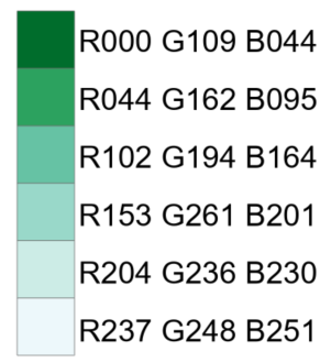
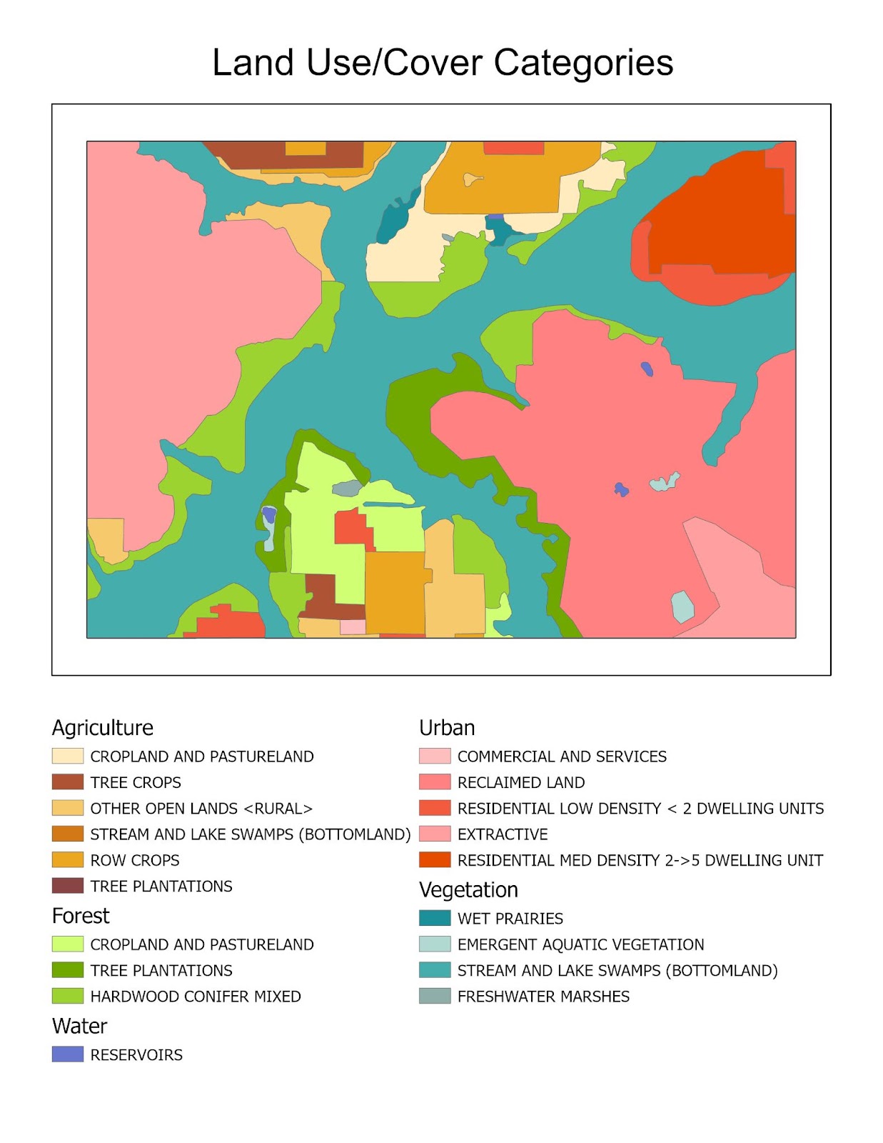
Part 4: Qualitative Colors in ArcGIS Pro
Designing a map with a large number of features can be challenging. In this section of the lab we were tasked with selecting appropriate colors for 16 distinct features.
I began by separating the features into general land use categories. I wanted to make features of a similar quality a similar hue. Agriculture is a series of orange/browns, forests are shades of saturated greens, urban areas are shades of red/salmon, vegetation are unsaturated blue-greens, and water is a single blue. Within each group, I selected several colors within that hue and altered the saturation and value number to produce similar but distinct shades for each category. I leaned heavily on the information presented in Chapter 7 of Designing Better Maps. I also used Color Brewer as a place to begin making my color schemes. Once I selected my initial colors I checked the map to make sure that each color was distinguishable from the others. I specifically spent extra time to make sure the forest and vegetation classes were distinguishable. At first, I was relying on hue alone to distinguish the two, and while it was clear on the legend it was not clear on the final map(green and blue/green were too close in hue). I accomplished this distinction by altering the saturation between the two groups. The forest colors are of a much higher saturation than those of the vegetation class.
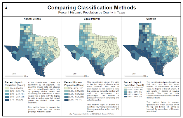
Part 5: Basic Choropleth Mapping
In this section we compare the differences in classification methods holding all other variables constant. We also practice creating derived data. All three maps are created using the same data, number of classes, and projected coordinate systems. Choosing an appropriate classification system can significantly change how a map is interpreted and as such it is very important to understand the differences between each.
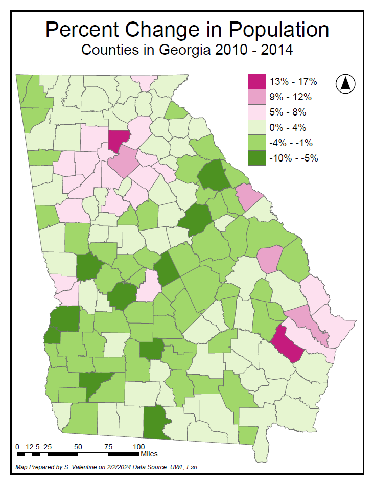
Part 6: Mapping Change Using Choropleth Mapping
Using everything we learned from previous steps, we were tasked with creating a map that represented the change in population in a state over time. This required creating a field in order to derive the percent change data that is represented in the map below. This also required us to use our knowledge of data coordinate systems to choose an appropriate projection.
I chose to use equal intervals and a diverging color scheme to represent the data. I am attempting to answer the question “Which counties experienced a population change within each 4% interval?” I used ColorBrewer to select a diverging color scheme since the data is representing change above and below zero. This is an appropriate choice because the extremes represent greater change than the values in the middle of the data set. (Brewer, 2016, 154)
References
Brewer, C. A. (2016). Designing Better Maps: A Guide for GIS Users (C. A. Brewer, Ed.). Esri Press.
Esri Contributors. (n.d.). Data classification methods—ArcGIS Pro | Documentation. ArcGIS Pro Resources | Tutorials, Documentation, Videos & More. Retrieved February 3, 2024, from https://pro.arcgis.com/en/pro-app/latest/help/mapping/layer-properties/data-classification-methods.htm
Kimerling, A. J., Buckley, A. R., Muehrcke, P. C., & Muehrcke, J. O. (2016). Map Use: Reading, Analysis, Interpretation. Esri Press.
Comments
Post a Comment