Proportional Symbol and Bivariate Choropleth Mapping
GIS 6005 Communicating GIS
Lab 6
Part 1: Basic Proportional Symbol Map
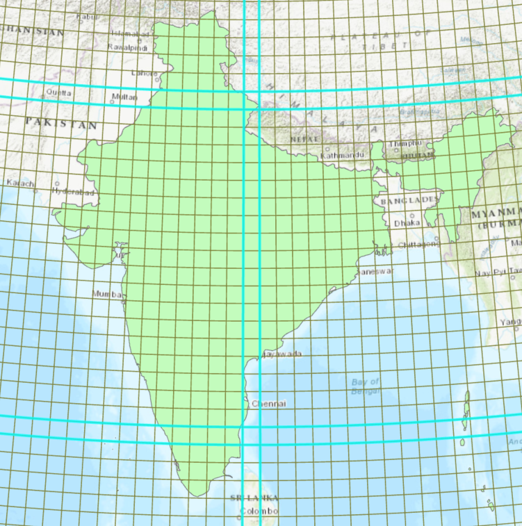
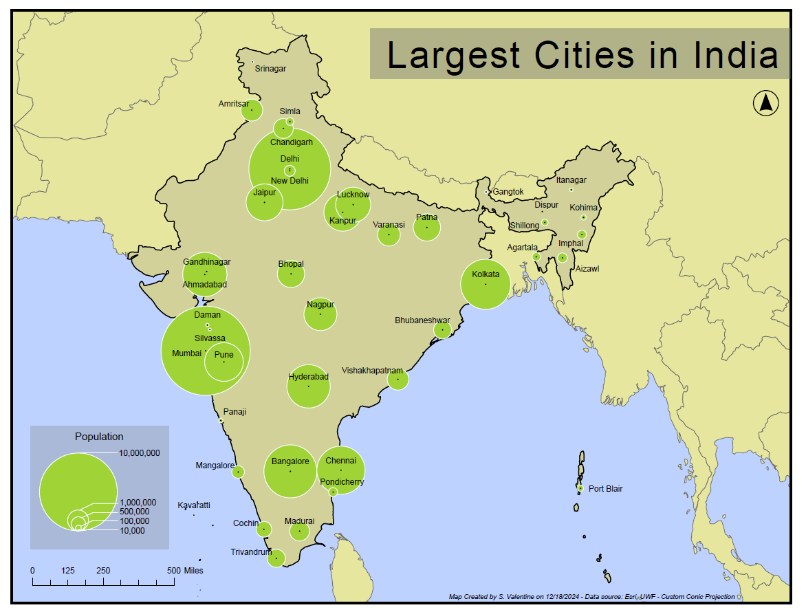
Proportional symbols are used to communicate magnitude with their size. In the map below proportional symbols are used to communicate the population of the largest cities in India. Notice that the background colors are less saturated, and that the proportional symbols are of a brighter color and more saturated. Instead of using a dark outline for the symbols, which can be distracting, I have chosen to outline them in white. This provides definition without obscuring the data. This map also features a custom nested legend. This map also had the added challenge of needing to have a custom projected coordinate system made. the screenshot below shows the whole number latitudes and longitudes on either side of the central Meridian and standard parallels.
Part 2: Proportional Symbol Maps for Positive and Negative Numbers
In this map I communicate both positive and negative numbers using proportional symbols. This requires more data manipulation than the previous map, but the resulting effect is worth the effort. I followed the same basic principles for choosing the symbology of the proportional symbols as I did in the last part. This map also features a custom nested legend, with the addition of patches communicating which colors represent positive numbers and which colors represent negative numbers.

Part 3: Bivariate Choropleth Mapping
In this section of the lab we compare the relationship between obesity and physical inactivity in a bivariate choropleth map. Part of the exercise is choosing appropriate colors and legend elements to represent the data.
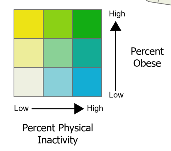
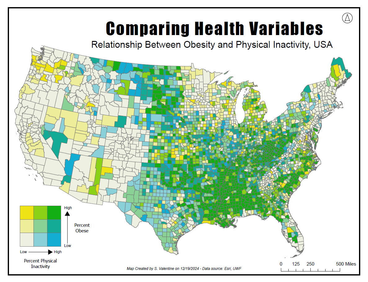
Bivariate mapping allows map makers to compare multiple variables and their interactions in a single map view. (Kimerling et al., 2016, 1188) When completing this type of mapping, the variables must have some meaningful relation (Stevens, 2015). Having a grid allows the end user to interpret this relationship with the various colors. This map in particular allows us to see when the variables are in strong agreeance or disagreeance. For example, areas that are high both in percent physical inactivity and in percent obesity appear as the darkest green. These are in agreement with each other. Other areas of the map are low in percent physical inactivity and high in percent obesity. These areas are not in agreement and appear as bright yellow.
References
Kimerling, A. J., Buckley, A. R., Muehrcke, P. C., & Muehrcke, J. O. (2016). Map Use: Reading, Analysis, Interpretation. Esri Press.
Stevens, J. (2015, February 18). Bivariate Choropleth Maps: A How-to Guide. Joshua Stevens. Retrieved February 19, 2024, from https://www.joshuastevens.net/cartography/make-a-bivariate-choropleth-map/
Comments
Post a Comment