Terrain Visualization
GIS 6005 Communicating GIS
Lab 3
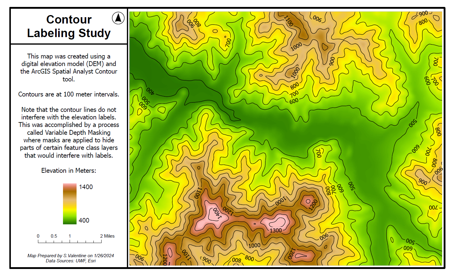
Part 1: Contours to Visualize Terrain
In this first section of the lab we created a map using a digital elevation model (DEM) and the ArcGIS Spatial Analyst Contour tool.
Contours are at 100 meter intervals.
Note that the contour lines do not interfere with the elevation labels. This was accomplished by a process called Variable Depth Masking where masks are applied to hide parts of certain feature class layers that would interfere with labels.
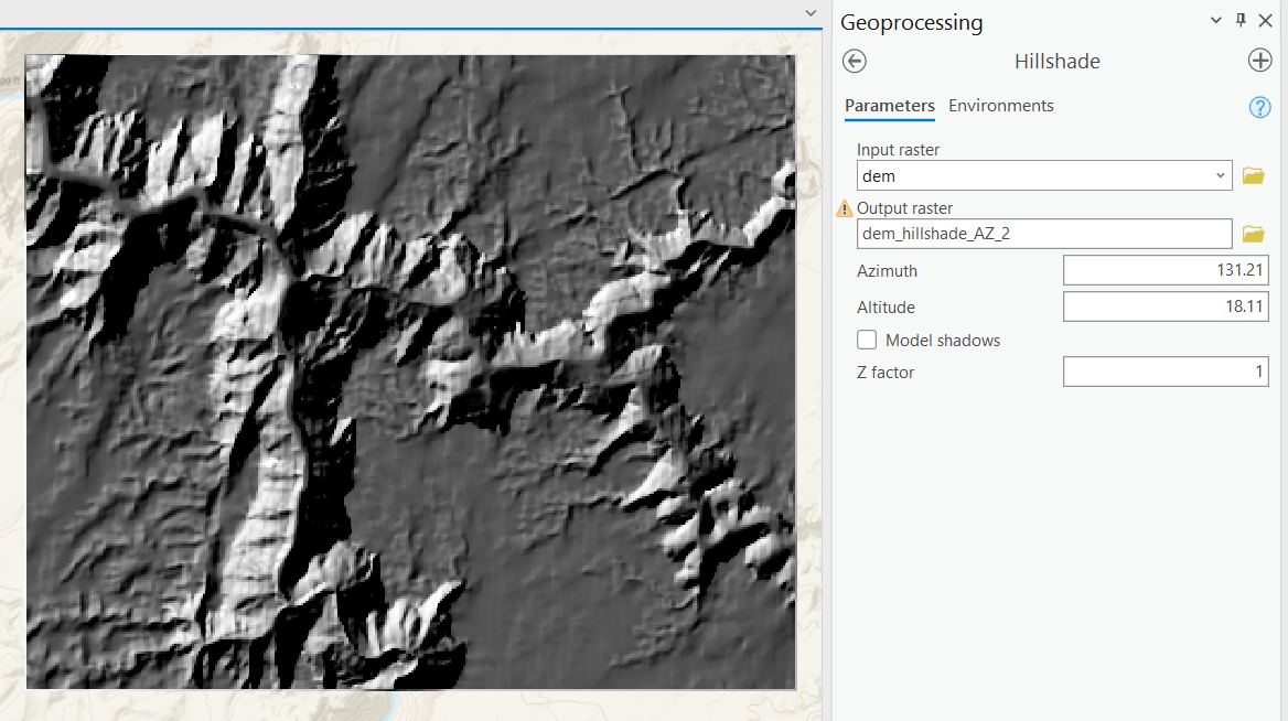
Part 2:Hillshading
Hillshading can be applied in a couple of different ways. In this lab we explore two different methods:
Spatial Analyst Hillshade tool found in the Geoprocessing library. Here we compare the default setting to custom settings for Azimuth and Altitude. THese can be calculated for a given location based on time and date using NOAA’s Solar Calculator. (https://pro.arcgis.com/en/pro-app/latest/help/analysis/raster-functions/hillshade-function.htm )
Below is a comparison of the default setting compared to one selected for an early winter morning.

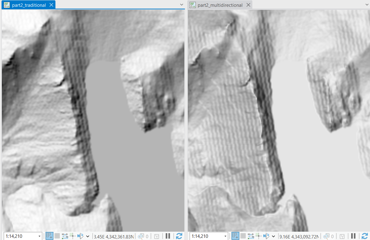
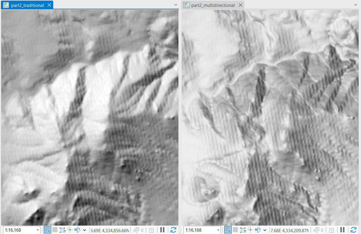
Hillshade found in the Raster Functions library. We apply this both traditionally and multidirectionality. BElow are comparisons of the two showcasing areas where the result is similar and where it is different.
Similar:
Different:
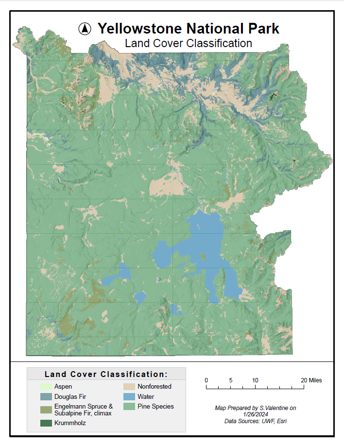
Part 3: Land Cover Map with Terrain Visualization
In this section of the lab we practiced using the hillshade methods from the previous section and incorporating it into a finished map.
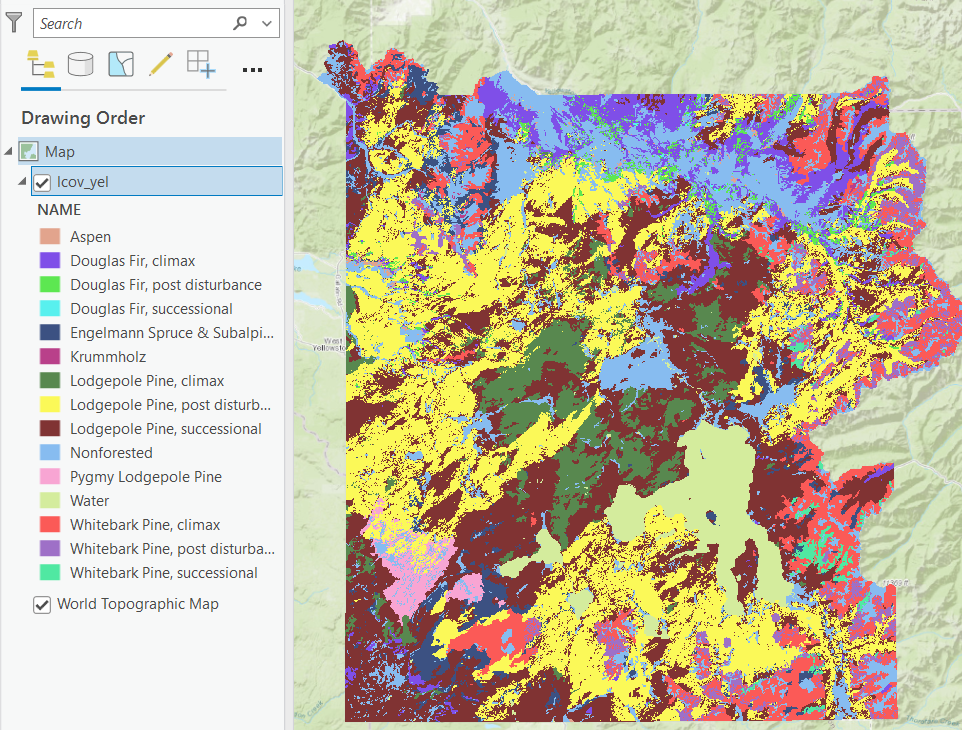
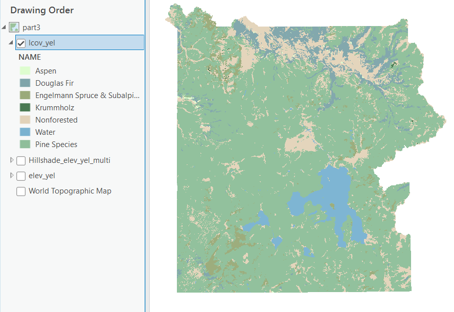
In order to get to this point I simplified the feature classes combining like classes for a simpler map. Below is a screenshot of the original number of feature classes for land cover classification. I decided to combine all the pines into a single feature class for simplicity.
Below: Revised feature classes. In selecting the greens for each of the tree species I was careful to make sure that they were distinct enough to be perceived, while still being representative. Aspen I chose a lighter green because their foliage is brighter, especially in spring. Douglas fir is represented by a blue green because their leaves have a glaucous layer underneath the leaf that can make the green of the leaves appear blue green. Non Forested areas are represented as a tan because it contrasts with all the other colors and makes those regions easily distinguishable. This layer is above the hillshade layer (following screenshot) and thus has the transparency lowered to allow the hillshade to show though creating a 3D effect.
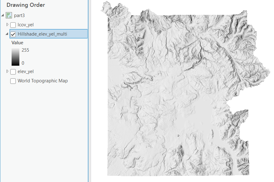
Below is the result of the multi directional hillshade created from the digital elevation model (DEM) of the study area.
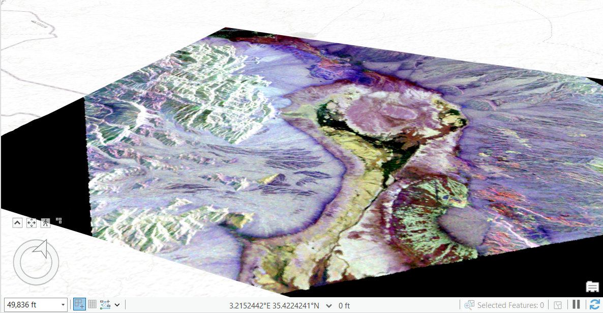
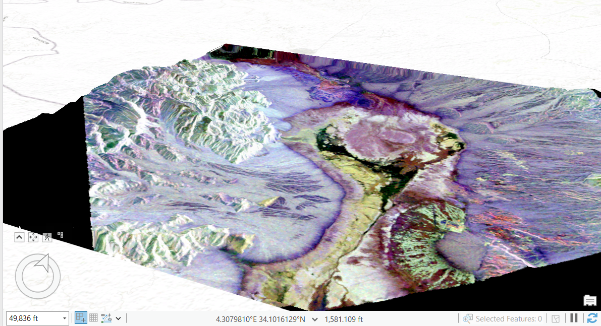
Part 4: Visualization of Terrain in 3D Scenes
Elevation can be effectively communicated using 3D modeling. Observe the screenshots below. These were both created in a local scene in ArcGIS Pro. These illustrate the difference between having a flat image and one that represents elevation 3-dimensionally. This is accomplished by adding an elevation source and draping a 2-d image overtop.
References:
Hillshade function—ArcGIS Pro | Documentation. (n.d.). ArcGIS Pro Resources | Tutorials, Documentation, Videos & More. Retrieved January 26, 2024, from
https://pro.arcgis.com/en/pro-app/latest/help/analysis/raster-functions/hillshade-function.htm
Kimerling, A. J., Buckley, A. R., Muehrcke, P. C., & Muehrcke, J. O. (2016). Map Use: Reading, Analysis, Interpretation. Esri Press.
Comments
Post a Comment