Analytical Data
GIS 6005 Communicating GIS
Lab 5
Part 1: Creating an Infographic
This assignment applied many of the skills that we have learned previously in this course.
Description Of Elements Used:
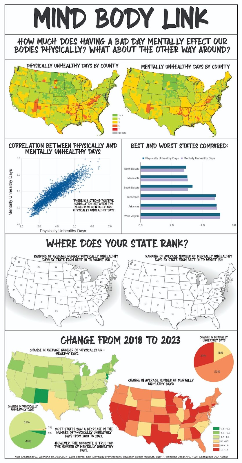
State Ranking:
For this graphic I found the average number of days reported in both physically and mentally unhealthy days by state. I did this by using excel’s Average if and rank function. I then exported the data to a CSV and imported it to ArcGIS inorder to use the labeling functions there. This is the most basic looking graphic and allows users to compare where their state ranks to others. I always want to know where my state ranks when I see infographics, so I decided to include this. It is more visual than a list and allows the user to gain a spatial understanding of the rank values. It is interesting to see where there are high concentrations of high and low values as well as largely different values between neighboring states.
Change from 2018 to 2023:
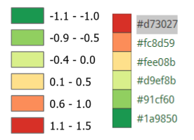
I completed the same steps as described in the state ranking for the data from 2023. I then used Excel to determine the amount of change from one year to the other. I brought this data into ArcGIS Pro and used the symbology pane to show these values. Both maps use the same color schemes and data breaks. I consider a decrease in either physically or mentally unhealthy days a good thing, so negative numbers are green. Positive numbers show an increase in unhealthy days and are visualized as red to communicate an undesirable change. A common color association is that green is good and red is bad, which is why I chose these colors. I used a color brewer to select a diverging color scheme.
Pie Charts:
These graphics answer the question: How many states fall into each legend category? Because I used color brewer I was able to use the hex values to exactly match colors between different programs and charts. I feel grateful that the color theory lab is placed before this one. I kept these simple but did include labels for each section describing the % of states in each category.
Overall Design Considerations:
I used a consistent set of colors to “tell my story”. Only deviating from my general color scheme to improve clarity. I chose a large page size to preserve clarity and legibility. I knew I wanted a number of US maps in my final layout, and due to the nature of the shape and size they take up a lot of room. I arranged my map in such a way as to lead the reader through a series of information and questions. I utilized alignment to make the map appear neat and polished. I also used a neatline and a series of rectangles to separate my layout into relevant sections. I utilized all the basic map design principles. Visual hierarchy allows the users at a glance to understand the basics of what is being communicated. I used figure ground to clearly distinguish which parts of the infographic were map elements. This is particularly evident in the state ranking map- since the states are white with a black outline I used a buffered ellipse as the background to help the maps stand out more clearly. I did my best to balance the layout so that everything looks evenly distributed, while also avoiding overly repetitive layouts.
Comments
Post a Comment