Map Design & Topography
GIS 6005 Communicating GIS
Lab 1
Part 1: Basic Map Design
In this section of the lab we are challenged to take an existing map and improve upon it using 5 of the map design principles that were covered in the reading and lecture material this week.
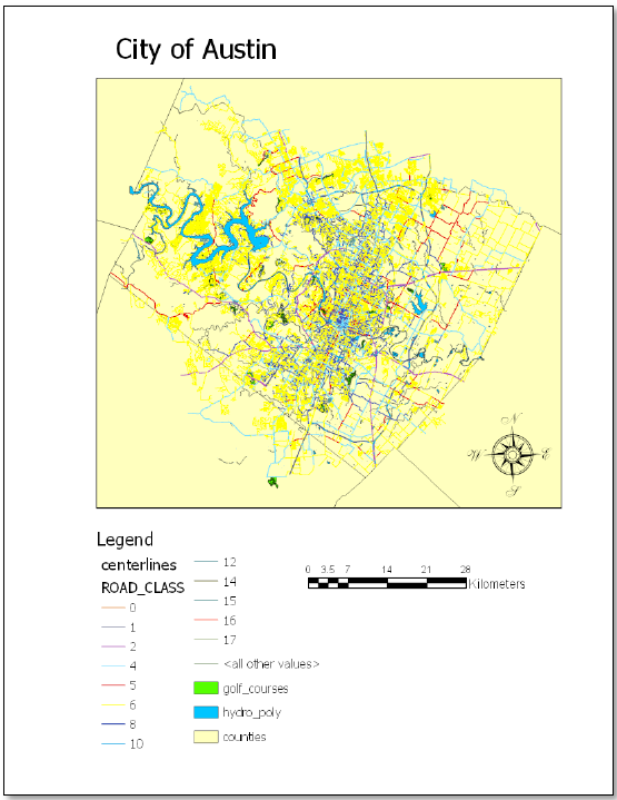
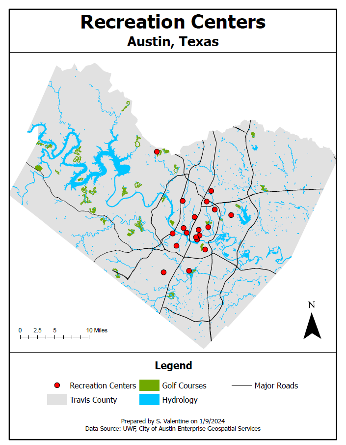
Compare the images below. These maps have the same information, however one does a much better job of communicating that information.
The paragraphs below discuss the changes that I made in order to increase the usefulness of the map:
Visual Contrast: Each feature class is a distinct and appropriate color, all of which have adequate contrast with each other to be clear and easy to interpret. The background (Travis County) is light but distinct and clearly shows the shape of the county against a white background. The golf course and hydrology layers stand out against the Travis County layers while also having adequate contrast from one another. The major roads layer is simple and clearly stands out against all the other layers. The recreation centers are by far the brightest and most contrasting shapes on the map drawing the users eye.
Legibility: I chose to simplify the symbology of almost every feature class to cut down on visual clutter. The most important features are the brightest and stand out the most (Recreation Centers). I chose clear simple fonts in appropriate sizes.
Figure Ground Organization: As discussed above, Travis County is light but distinct and clearly shows the shape of the county against a white background.
Hierarchical Organization (Visual Hierarchy): The most important elements are the largest and brightest. The title and sub title of the map are large and bold. The legend title is also bold although somewhat smaller than the subtitle. The legend is simple and easy to read with a font that is smaller than the legend title and not bolded. The north arrow, scale, cartographer's name, date, and data sources are all small, unbolded, and unobtrusive but legible. Recreation centers are the focus of this map so their symbology is the brightest and most distinctive (red with a black outline). The next most distinctive is the major roads feature class, which is represented by plain black lines. The golf course and hydrology layers stand out against the Travis County layers while also having adequate contrast from one another.
Balance: When possible I centered the map elements. The map frame is centered and goes completely across the page (stopping at the neatline). I centered the title, subtitle, legend, cartographer's name, date, and data source. The scale is balanced with the north arrow in the negative space in the lower corners of the map fame. This give the map an almost symmetrical appearance with no part out of proportion with any of the others.
Part 2: Modifying Map Design
Much like in Part A we are asked to re work a map, but this time we are asked to repurpose a map to a new audience.
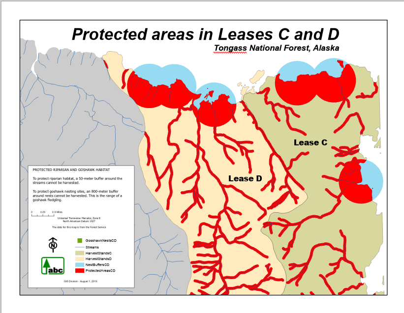
Original Map:
11x17 inch map meant to educate end users on the protected areas.
Repurposed Map:
8.5x11 inch map aimed at potential harvesters. This map still notes the protected areas, but the focus is on the potential value of each area.
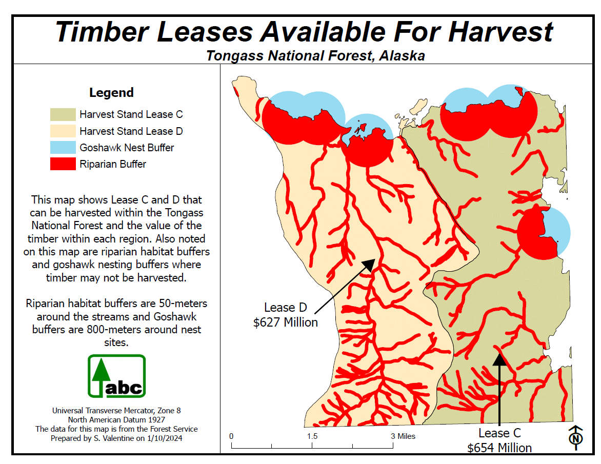
As with part 1, this map was redesigned with the 5 design principles:
Visual Contrast: The map within the frame was already pretty well designed. All I did here was remove a few layers (general area and streams). I opted to keep the protected areas as this is important information for potential logging companies.
Legibility: To increase legibility I moved the labels for Lease C and D to outside the map area and used leader lines. I did this because text over the lease areas was difficult to read and got lost visually. I also reworked the description to be more relevant to the new end users of this map.
Figure Ground Organization: Removing the general area layer left just the lease areas clearly defined against the white of the page background. It is very clear which areas are part of the map and which are not.
Hierarchical Organization (Visual Hierarchy): Title and sub title are the most imports, therefore are the largest and in bold. Following this is the legend title in bold. Each lease area is in a font the same size as the legend title , but not bolded. The description text is smaller that the previously mentioned map elements. The smallest information is about the projection, data source, and cartographer. The North arrow and scale bar are similarly small and unobtrusive.
Balance: Given the shape of the lease areas I opted to keep the layout in landscape orientation, but divide the page into 3 areas: A title/subtitle block, map block, and an information block. There is an appropriate amount of white space, meaning that map elements are evenly spread over the page and take up most of the page without being cluttered or crowded.
Part 3: Basic Typography
Using the concepts of legibility, visual contrast, hierarchy we are tasked with Labeling a blank map of the San Francsico area in California. All of these labels were hand placed (no dynamic text) to give us full control of the placement and formatting of each label.
Labels added to the map:
General
▪ San Francisco
▪ Marin Peninsula
▪ Treasure Island
▪ Sausalito
▪ Angel Island
Water Features
▪ San Francisco Bay
▪ Golden Gate
▪ Lake Merced
Park Names
▪ Golden Gate Park
▪ Presidio of San Francisco
▪ Lincoln Park
Landmarks
▪ Golden Gate Bridge
Topographic Features
▪ Nob Hill
▪ Russian Hill
▪ Twin Peaks
▪ San Miguel Hills
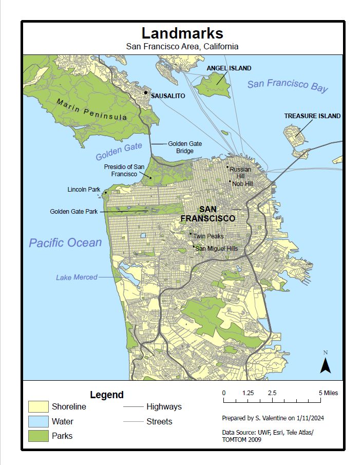
Discussion of the application of Design Concepts:
General: To provide visual hierarchy, San Francsico has the largest and boldest font (14pt, bold) and is in all capital letters. This also serves to preserve legibility an fonts over busy backgrounds can be difficult to read. Chapter 6 of Designing Better Maps directs us to use all capital layers sparingly, which is why these are the only labels in all caps (Brewer, 2016, 117). The next largest is the label for the Marin Peninsula (12 pt), this is unbolded but has increased letter spacing to stretch out over the peninsula. There is also a curve to this label to help communicate that it is spanning a wide region instead of a particular point. The remaining 3 labels in the category are 10pt, bold, and in capital letters. They each required a leader line pointing to the feature to preserve legibility. When a label cannot fit entirely within the boundary of a feature it is appropriate to move the label to the outside of the feature. I decided how and where to place my labels based on the reading from Brewer (Brewer, 2016, 116). I selected the best label placement that was available. Instead of a leader line I used a point symbol for the location of Sausalito. I followed the guidelines for this from Brewer, figure 6.30 on page 116.
Water Features: I selected a blue that contrasted with the water layer. I used an italic style, which is common for communicating water features. The largest bodies of water have the largest font size and get gradually smaller as the size of the feature decreases. This communicates hierarchy to the end user.
Park Names, Landmarks, Topographic Features: To avoid losing legibility or making the map too busy to read I used the same formatting for these last 3 categories. Chapter 6 of Brewer goes into explicit detail with examples of how to label features with points (Brewer, 2016, 116 -120). I used this for Lincoln Park, Twin Peaks, San Miguel Hills, Russian Hill and Knob Hill. They also suggest that using lowercase letters can increase legibility, especially against busy backgrounds. That is why for these categories I used sentence case only. Though these are the smallest labels on the map, they are still of sufficient size to have visual contrast against the visually busy streets feature class. Also having the font in black helps keep appropriate levels of contrast and legibility. These features sit at the bottom of the visual hierarchy and thus have smaller and less obtrusive labels than the previous categories.
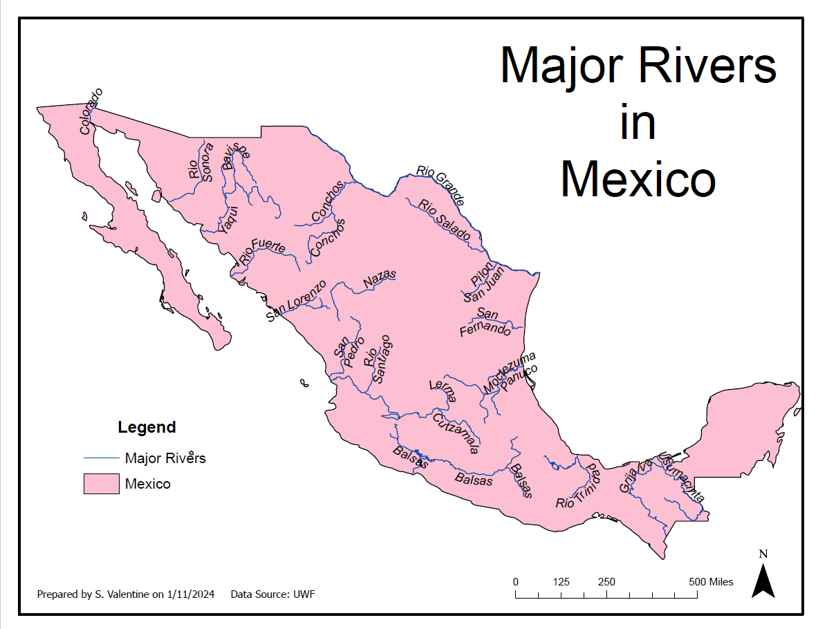
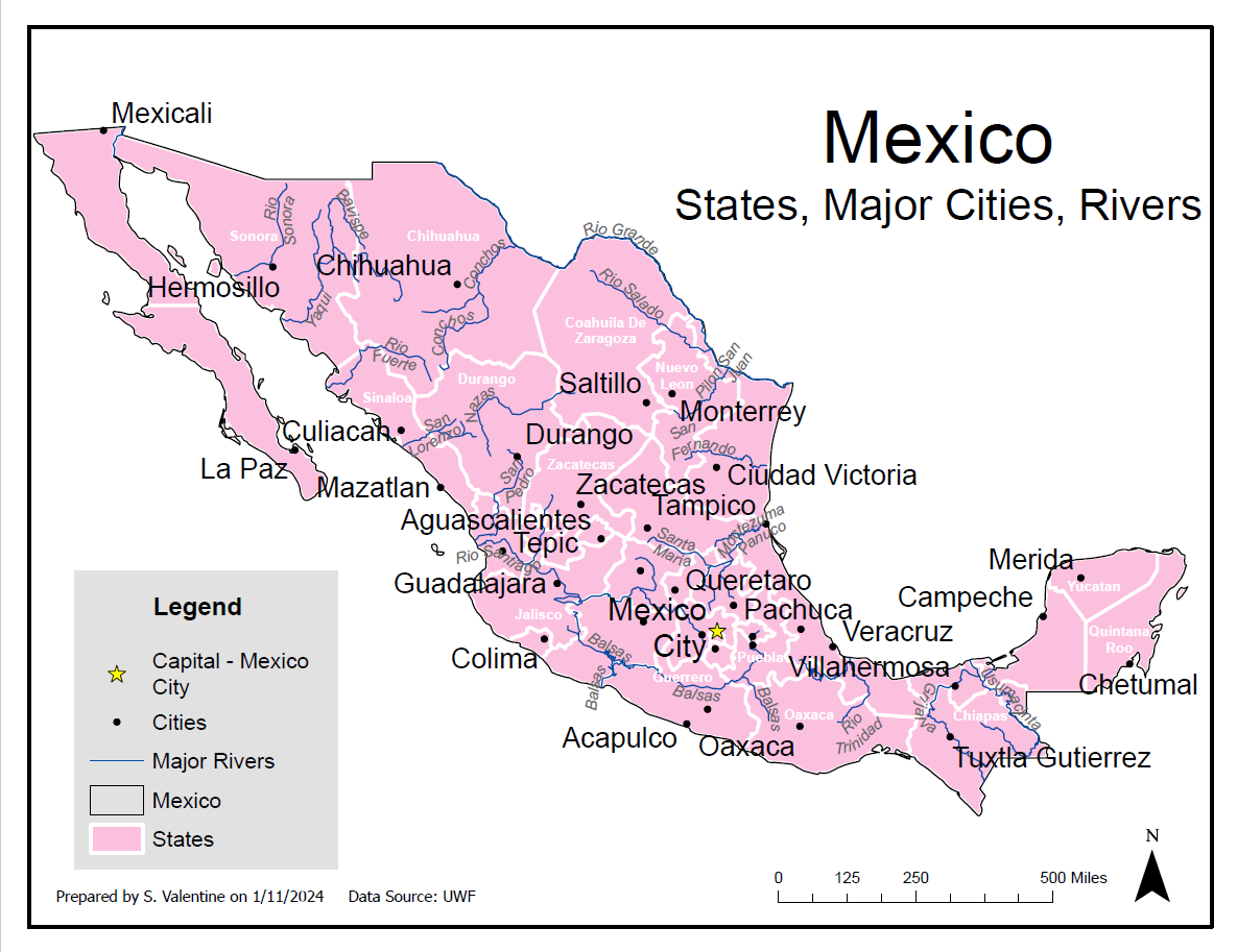
Part 4: Detailed Typography for Rivers in Mexico & Part 5: Effectively Labelling Multiple Features in a Map
This section of lab focused on using the labeling feature of GIS to label features as effectively as possible. To do this we developed a labeling strategy using label placement using preset options under the labeling tab, altered priorities, set weights, and developed a unique style for each feature class.
Comments
Post a Comment